How to Design a Website the Right Way: The Complete Guide to Modern Web Design
Introduction
Most websites fail before anyone even reads the first line of copy.
Not because the product is bad. Not because the business is weak. They fail because the website is built without a clear design system, without understanding who it is for, and without any thought given to how someone actually moves through it.
I have worked on websites for businesses in Nigeria, the UK, and across Europe. And the pattern is almost always the same. A business owner invests money to get a site built. It goes live. Traffic comes. And then nothing happens. No enquiries. No sales. No trust.
The design is usually the problem.
Good web design is not about making something look nice. It is about solving a specific problem for a specific person at a specific moment. Every visual decision, every layout choice, every word on the page either helps that person or pushes them away.
This guide covers every critical element of web design done right. UI and UX principles, responsive design, visual hierarchy, brand identity, typography, page speed, layout systems, and conversion design. Each section has its own deep-dive article if you want to go further.
If you are a business owner, a developer, or a designer trying to build something that actually works, this is where you start.
01 — UI and UX: The Foundation of Every Design Decision
Most people confuse UI and UX. They are not the same thing, and treating them as the same is one of the most expensive mistakes a web project can make.
UI is what the user sees. UX is what the user feels and does.
UI covers your button shapes, your color palette, your icon set, your font choices, your spacing system. UX covers the path a user takes from landing on your page to completing the action you want them to take. A website can look visually clean and still be a nightmare to use. It can also be simple in appearance and move people through a journey so smoothly they complete the action without thinking about it.
Good UX starts with research. You need to know who your user is, what they are trying to do, and where they usually fail. At JetherVerse, before we design a single element, we map out the user journey. Where do they come from? What do they want? What question do they have when they land? What would stop them from taking the next step?
The answers to those questions drive every design decision.
For UI, the key discipline is consistency. Your design system should have one set of rules that every element follows. One type scale. One spacing grid. One color system. When users see consistency, they feel trust without knowing why. When they see inconsistency, they feel friction without knowing why.
The interface must also be accessible. Contrast ratios that pass WCAG standards. Focus states on interactive elements. Alt text on images. Keyboard navigability. Accessibility is not a nice addition. It is a baseline requirement for any professional web build.
Read more about UI/UX Design Principles for Websites →
02 — Responsive Design: Building for Every Screen
In 2026, more than 60% of global web traffic comes from mobile devices. In Nigeria, that number is above 70%. If your website breaks, shrinks awkwardly, or becomes difficult to use on a phone, you are losing more than half your audience before they read a word.
Responsive design means your website adapts its layout, typography, spacing, and interactive elements based on the size of the screen viewing it. Not a separate mobile version. One codebase, one design system, every screen.
The right approach is mobile-first. You design for the smallest screen first, then expand the layout as screen size increases. This forces you to prioritise. What is the most important element on this page? What does a user on a phone, with one hand, with limited time, need to see first?
Fluid layouts use CSS Grid and Flexbox to create structures that stretch and compress intelligently. Images use responsive sizing to load appropriately for the device. Touch targets are large enough to tap without error. Text is readable without zooming.
Breakpoints should be content-driven, not device-driven. Instead of setting breakpoints at specific phone models, you set them at the point where your layout starts to break down. This produces cleaner, more durable responsive behaviour across the full range of devices.
Testing is non-negotiable. A site must be tested on real devices, not just browser developer tools. Real devices show you layout bugs, tap target issues, and font rendering problems that simulators miss.
Read more about Responsive Design and Fluid Layouts →
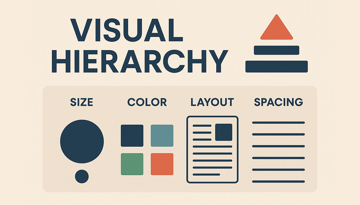
03 — Visual Hierarchy and Typography: Guiding the Eye
Every page has a job. The job of visual hierarchy is to tell the user where to look first, where to go next, and what to do at the end.
Without hierarchy, a user lands on a page and sees everything at equal weight. Their eye does not know where to go. Within two seconds, they leave.
Size is the most direct tool. Large elements claim attention. Small elements recede. Your most important message should always be your largest text element on the page. But size alone is not enough.
Weight creates contrast. Bold text draws the eye. Light text retreats. When used together on the same page, they create a visual rhythm that guides reading.
Spacing communicates relationship. Elements that belong together sit close. Elements that are separate breathe. White space is not empty space. It is a design decision.
Color directs focus. A single colored element on a neutral background will always capture attention first. Use this deliberately to highlight CTAs, important figures, or critical messages.
Typography is not decoration. The fonts you choose carry meaning before a single word is read. A heavy slab serif says something different than a geometric sans. Your type choices should match your brand, support readability, and maintain consistency throughout.
The rule for web typography: maximum two font families. One for headings, one for body. If you want variation, use weight and size within those families. Loading four different typefaces slows your site and creates visual noise.
Line length, line height, and paragraph spacing all affect reading comfort. Aim for 55 to 75 characters per line for body text. Line height between 1.4 and 1.6. Paragraph spacing that gives the eye a clear place to pause.
Read more about Visual Hierarchy and Typography in Web Design →
04 — Brand Identity in Web Design: Making It Yours
A website is the most visible expression of your brand. Everything on it, colors, fonts, imagery, tone of voice, spacing, even the shape of your buttons, communicates who you are to the person reading it.
Most small business websites have a brand identity problem. They look like they could belong to any business. Nothing is distinctive. Nothing is memorable. The client was handed a theme, a few stock photos were dropped in, and it was called done.
Brand identity in web design starts before the first mockup. It starts with clarity about who you are, who you serve, and what you want people to feel when they interact with you.
Your color palette should be purposeful. Primary colors carry your brand. Secondary colors create accent and contrast. Background and neutral colors provide the stage. Every color in your system should have a defined role. It should not be used at random.
Your visual style, whether you use photography or illustration, the density of your layouts, the amount of white space, the level of detail in your icons, all of it should feel intentional and consistent.
Tone of voice is part of brand identity. The words on your buttons, your headlines, your error messages. These are all brand touchpoints. A formal law firm sounds different from a creative agency. Your copy should sound like your brand, not like a default WordPress theme.
Brand identity is not about being loud. It is about being recognisable. A user who visited your site six months ago and comes back should immediately know they are in the right place.
Read more about Brand Identity in Web Design →
05 — Page Speed and Performance: The Design Nobody Sees
A beautifully designed website that loads in eight seconds is a failed website.
Page speed is not a developer concern added on at the end. It is a design decision made from the beginning. The images you choose, the fonts you load, the animations you include, the third-party scripts you pull in, all of these are design choices with performance consequences.
Google uses Core Web Vitals as a ranking signal. Largest Contentful Paint measures how quickly the main content of a page loads. Cumulative Layout Shift measures how much the page jumps around as it loads. Interaction to Next Paint measures how quickly the page responds to user actions.
Failing these metrics does not just hurt your rankings. It hurts your conversions. Every additional second of load time reduces conversions. On mobile connections, which is how most Nigerians browse, a slow site is a dead site.
The design principles for performance: optimise and compress every image before it goes online. Use modern formats like WebP. Implement lazy loading for images below the fold. Choose a limited set of fonts and load only the weights you actually use. Avoid render-blocking scripts. Build on a fast host with a CDN.
Animation and interaction design also affect performance. CSS animations are cheaper than JavaScript animations. Transitions should feel fast even when they are not instant. The perceived speed of a site is as important as the actual speed.
Read more about Page Speed and Performance Optimisation →
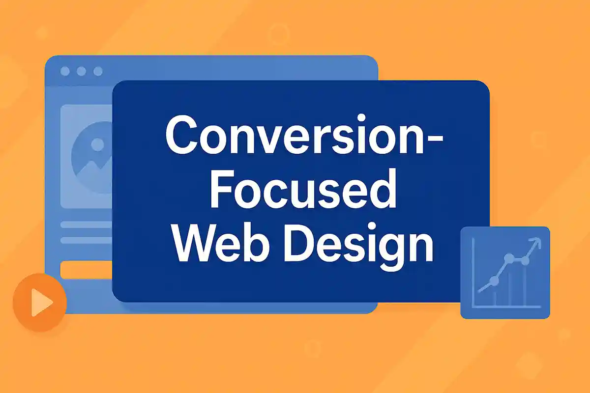
06 — Conversion-Focused Design: Building a Site That Earns
A website that does not convert is a brochure. An expensive, time-consuming, pixel-perfect brochure that does nothing for your business.
Conversion-focused design means every element on every page is placed with purpose. The goal is always to move the user toward one specific action. Not ten actions. One.
Call to action design is where most websites fail. A CTA button that says "Submit" or "Click Here" is invisible. A CTA that says "Get My Free Audit" or "Start My Project" tells the user exactly what they are getting. Clear, specific, benefit-driven CTAs convert. Generic ones do not.
Above the fold, within the first screen a user sees without scrolling, you need four things. Who you are. What you do. Who it is for. And what to do next. If a user cannot answer those four questions in five seconds, the page is failing.
Trust signals matter. Client logos, testimonials, case studies with numbers, certifications, awards. These are not optional extras. They are the evidence your visitor needs to take the next step. Without them, you are asking people to trust you based on nothing.
Form design affects conversion. Every extra field reduces completion rates. Ask only for what you genuinely need. Label fields clearly. Show inline validation so the user knows immediately if they made an error. Make the submit button clear and obvious.
Landing pages for specific campaigns should have no navigation. No distractions. One goal, one path, one action. The more focused the page, the higher the conversion rate.
Read more about Conversion-Focused Web Design and CTA Best Practices →
Conclusion
Web design is not a single skill. It is a discipline that sits at the intersection of psychology, technology, visual communication, and business strategy.
Every element on your website either helps your user or creates friction. There is no neutral. The choice of a font size, the placement of a button, the speed of a page load, all of it adds up to an experience that either builds trust and drives action, or loses the visitor within seconds.
The six areas in this guide are not optional extras. They are the foundation. If any one of them is done poorly, the whole site suffers.
Start with understanding your user. Build with responsiveness and performance as defaults. Design with brand consistency and visual hierarchy. Convert with clear, specific, benefit-driven actions.
That is how you design a website the right way.
Download the Complete Web Design Playbook
Want the full step-by-step implementation guide? The JetherVerse Web Design Playbook includes checklists, design decision frameworks, tools, and common mistakes to avoid.
Download Playbook (Free) →
Includes: Implementation checklist, design standards reference, tools list, and the complete web design process from brief to launch.
Ready to Build or Redesign Your Website?
JetherVerse builds websites that look sharp, load fast, and convert visitors into customers. From Benin City, Nigeria, we work with businesses across West Africa, the UK, and beyond.
Get Started:
- Email: info@jetherverse.net.ng
- Phone: +234 915 983 1034
- Website: www.jetherverse.net.ng