Responsive Web Design in 2026: The Complete Guide to Fluid Layouts and Mobile-First Development
Introduction
I once audited a website for a Lagos-based logistics company that was spending a decent budget on Google Ads. Traffic was coming. Nothing was converting. I opened the site on my phone and immediately saw the problem. The homepage hero image was loading a desktop-sized JPEG that took nine seconds on a 4G connection. Half the navigation links were too small to tap without mis-pressing. The enquiry form had fields so close together that filling it in on a phone screen was an exercise in frustration.
Their ads were driving traffic to a site that functioned as a barrier.
This is not rare. It is the standard for businesses that built websites without responsive design as a foundation.
In 2026, responsive design is not a feature. It is a baseline requirement. A site that does not work properly on a phone is a site that fails the majority of its visitors. In Nigeria, where mobile internet accounts for over 70% of web traffic, a broken mobile experience is not a missed opportunity. It is a broken business tool.
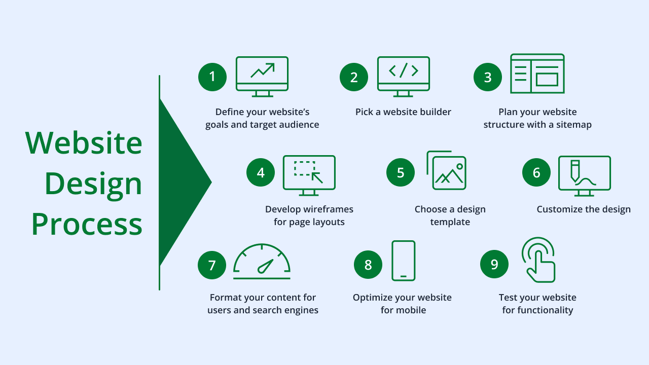
This guide covers everything you need to understand and apply responsive design properly. Mobile-first methodology, fluid layouts using CSS Grid and Flexbox, responsive typography, image optimisation, breakpoint strategy, and testing.
What Responsive Design Actually Means
Responsive design is a development approach where a website automatically adjusts its layout, typography, spacing, images, and interactive elements to display correctly on any screen size.
It is not a separate mobile site. It is not a theme you toggle. It is one codebase, one design, one set of content, adapting to the viewport.
The concept was introduced by Ethan Marcotte in 2010. The original three components were fluid grids, flexible images, and media queries. The core idea remains the same. The tools and techniques have evolved significantly.
In 2026, the toolkit includes CSS Grid, Flexbox, container queries, viewport units, intrinsic sizing, and fluid typography with clamp(). When applied correctly, these tools produce layouts that adapt fluidly across the full range of screen sizes without needing individual breakpoints for every device.
The goal is not to make your site look identical on every screen. It is to make the content accessible, readable, and actionable on every screen. A two-column layout on desktop may become a single column on mobile. A horizontal navigation becomes a hamburger menu or a bottom navigation bar. A data table may scroll horizontally or collapse into a card layout. These are appropriate adaptations, not failures.
Mobile-First Design: Why You Start Small
Mobile-first is a design philosophy where you design and build the smallest screen experience first, then progressively enhance for larger screens.
The opposite approach, designing for desktop and then scaling down, is still common. It is also consistently more difficult, produces worse results on mobile, and leads to performance problems.
Here is why mobile-first works better.
Constraints clarify priorities. A phone screen is small. You cannot fit everything. Designing for it first forces you to ask: what does this user actually need on this page? What is the most important element? What can be cut? The answers to those questions produce better design for all screen sizes, not just mobile.
CSS is easier to extend than to restrict. Writing styles for a small screen and adding complexity for larger screens using min-width media queries produces cleaner, more predictable CSS than writing desktop styles and using max-width queries to override them. Mobile-first CSS is shorter, easier to maintain, and less prone to specificity conflicts.
Performance benefits from the start. Mobile-first development encourages you to start with the minimal necessary CSS and progressively add. It reinforces the habit of not loading resources that small screens do not need.
In practice, mobile-first means your base CSS, the styles with no media query, defines the mobile layout. Min-width media queries add layout complexity as screens grow.
/* Base mobile layout */
.grid {
  display: grid;
  grid-template-columns: 1fr;
  gap: 16px;
}

/* Tablet and above */
@media (min-width: 768px) {
  .grid {
    grid-template-columns: 1fr 1fr;
    gap: 24px;
  }
}

/* Desktop */
@media (min-width: 1200px) {
  .grid {
    grid-template-columns: repeat(3, 1fr);
    gap: 32px;
  }
}
CSS Grid: Building Fluid Layouts
CSS Grid is the most powerful layout tool available in modern CSS. It gives you direct control over both dimensions of a layout simultaneously, which is something no previous CSS tool could do cleanly.
For responsive design, Grid's most useful feature is the ability to define columns that adapt to available space without explicit breakpoints.
The auto-fill and auto-fit keywords combined with minmax() create layouts that automatically adjust the number of columns based on available space.
.card-grid {
  display: grid;
  grid-template-columns: repeat(auto-fill, minmax(280px, 1fr));
  gap: 24px;
}
This single declaration creates a grid that shows one column when the container is narrow, two columns when there is space for two cards of minimum 280px, three when there is space for three, and so on. No media queries needed.
Grid is also ideal for page-level layouts. Defining a main content area and sidebar that stack on mobile and sit side by side on desktop requires minimal code.
.page-layout {
  display: grid;
  grid-template-columns: 1fr;
  gap: 32px;
}

@media (min-width: 900px) {
  .page-layout {
    grid-template-columns: 1fr 320px;
  }
}
Template areas make complex layouts readable and maintainable.
.site-layout {
  display: grid;
  grid-template-areas:
    "header"
    "nav"
    "main"
    "aside"
    "footer";
}

@media (min-width: 768px) {
  .site-layout {
    grid-template-areas:
      "header header"
      "nav    nav"
      "main   aside"
      "footer footer";
    grid-template-columns: 1fr 300px;
  }
}
Flexbox: For Component-Level Responsiveness
Where Grid handles two-dimensional page layouts, Flexbox handles one-dimensional component layouts. Rows of navigation items, card content, icon and text pairings, button groups. Flexbox is the right tool for these.
The key responsive behavior in Flexbox is flex-wrap. When items exceed the container width, they wrap to a new line rather than overflow.
.feature-list {
  display: flex;
  flex-wrap: wrap;
  gap: 16px;
}

.feature-item {
  flex: 1 1 200px; /* grow, shrink, minimum basis */
}
This creates a row of feature items that wraps naturally to multiple rows when the container is too narrow for them side by side.
Flexbox also handles alignment and distribution, centering items both horizontally and vertically, distributing space evenly between items, and aligning items to the start, end, or center of the cross axis. These properties work responsively because they respond to the available space in the container.
Grid and Flexbox are not competing choices. They work together. Grid for overall page structure. Flexbox for components within that structure.
Responsive Typography: Scaling Text With the Viewport
Typography on a responsive site must scale appropriately. Text that is comfortable to read on a 1440px desktop monitor may be too small on a phone or too large on a 4K screen.
The traditional approach is setting different font sizes in media queries. This works but requires many breakpoints to get smooth scaling.
The modern approach uses CSS clamp() to define fluid typography that scales continuously between a minimum and maximum size based on the viewport width.
h1 {
  font-size: clamp(2rem, 5vw + 1rem, 4rem);
}

p {
  font-size: clamp(1rem, 2.5vw, 1.25rem);
}
The clamp() function takes three values: minimum size, preferred size, maximum size. The preferred size is calculated relative to the viewport width using vw units. On a small screen, the minimum is applied. On a large screen, the maximum is applied. Between those extremes, the size scales fluidly.
This approach eliminates the need for font-size overrides in multiple breakpoints and produces smoother scaling across the full range of screen sizes.
Line height, letter spacing, and paragraph width should also be responsive. At small sizes, slightly increased letter spacing improves legibility. At large display sizes, reduced tracking can improve appearance. Line length should stay within the comfortable reading range of 55 to 75 characters regardless of screen size.
Responsive Images: The Most Common Performance Mistake
Unoptimised images are the leading cause of poor performance on responsive websites. A common pattern is serving a 2000px wide image to a phone screen that is 390px wide. The image downloads at full size, taking far longer than necessary, and then gets scaled down by the browser to fit.
The correct approach has three components.
First, create multiple image sizes. For each image, generate versions at the sizes you actually need: 400px, 800px, 1200px, 1600px for example. Use modern formats. WebP offers significantly smaller file sizes than JPEG or PNG at equivalent quality. AVIF is even more efficient where browser support exists.
Second, use the srcset and sizes attributes on img elements to tell the browser which version to load based on the device's screen size and pixel density.
<img
  src="hero-800.webp"
  srcset="hero-400.webp 400w, hero-800.webp 800w, hero-1200.webp 1200w, hero-1600.webp 1600w"
  sizes="(max-width: 600px) 100vw, (max-width: 1200px) 80vw, 1200px"
  alt="JetherVerse web design team"
>
The browser uses this information to request the most appropriate file for the current viewport and device pixel ratio. A phone with a 390px wide screen will load the 400px image. A retina MacBook will load the 1600px image.
Third, use lazy loading for images that are not visible on initial page load.
<img src="below-fold-image.webp" loading="lazy" alt="Description">This prevents images below the fold from loading until the user scrolls near them, significantly reducing initial page load time.
For background images set in CSS, use media queries to serve appropriately sized images.
.hero {
  background-image: url("hero-mobile.webp");
}

@media (min-width: 768px) {
  .hero {
    background-image: url("hero-desktop.webp");
  }
}
Breakpoint Strategy: Content-Driven, Not Device-Driven
A breakpoint is a point in your CSS where the layout changes based on screen width. The wrong approach to breakpoints is designing for specific devices: phone, tablet, desktop. Device sizes change constantly. There is no definitive list.
The right approach is content-driven breakpoints. You design the layout, and where the layout starts to break down, you add a breakpoint to fix it. The breakpoint is at the point where the content needs it, not at an arbitrary device width.
In practice, most websites end up with breakpoints in similar ranges: around 480px for small phones, 768px for tablets and larger phones, 1024px for small desktops, 1280px and 1440px for standard desktops. But these are starting points, not rules. Let the content tell you where to break.
Container queries are a more recent development that allows components to respond to the width of their container rather than the viewport. This is particularly useful for design systems where the same component might appear in different layout contexts: a full-width section versus a narrow sidebar, for example.
.card-container {
  container-type: inline-size;
}

.card {
  /* Default card layout */
}

@container (min-width: 400px) {
  .card {
    /* Wider card layout when container allows */
  }
}
Container queries allow components to be genuinely portable across layouts without requiring viewport-level media query overrides.
Navigation on Mobile: Getting It Right
Navigation is one of the most complex responsive design challenges. Desktop navigation typically displays all primary links horizontally in the header. This pattern breaks on mobile screens.
Common mobile navigation patterns and when to use each:
Hamburger menu: Most widely understood. A three-line icon that opens a full-screen or slide-in menu. Works well for sites with many navigation items. The main risk is that it hides navigation completely, reducing discoverability. If you use a hamburger menu, the most important links should also appear as buttons or links elsewhere on the page.
Bottom navigation bar: Increasingly common on mobile, following the pattern established by native apps. Keeps core navigation visible and accessible with one thumb. Works best for sites with four to five primary destinations. Not appropriate for sites with more links than the bar can accommodate clearly.
Priority-plus pattern: Shows the most important links in the available space and collapses the rest into a "More" dropdown. Keeps key links visible while handling overflow gracefully.
Anchor links on long pages: For single-page or long-form content, visible anchor links near the top of the page or in a sticky sidebar can replace traditional navigation on mobile without the complexity of a menu system.
Whatever pattern you choose, navigation should always be reachable. A user should never be more than one tap from the menu. On pages where the user has scrolled significantly, a sticky or floating navigation element ensures they never have to scroll back to the top to navigate.
Testing Responsive Designs: What You Must Check
Testing in browser developer tools is useful for quick iteration. It is not sufficient for final validation.
Browser developer tools simulate screen sizes but cannot reproduce all the variables of a real device. Touch behavior, font rendering, scroll behavior, system font sizes, browser chrome taking up screen space, these all differ on real hardware.
Minimum testing checklist for any responsive build:
Test on at least one real Android phone and one real iPhone. These are the two most common platforms and they render differently.
Test with system font size increased. Many users, particularly older users and those with visual impairments, increase their device's default font size. This can break layouts that assume a specific base font size.
Test with slow network throttling. Chrome developer tools allow you to simulate a 3G or slow 4G connection. Run your site on this setting and note what the user sees during load. What loads first? What jumps around?
Test touch targets. Go through every interactive element on mobile and tap each one. Any element that requires precision tapping, that you accidentally tap something adjacent, or that does nothing on first tap is a problem.
Test forms end to end on mobile. Fill in every field, submit the form, and verify the confirmation state is visible without scrolling.
Test in landscape orientation. Many users hold their phone horizontally, particularly when watching content or filling in forms. Your layout should not break in this orientation.
Test on older devices if your audience includes lower-income markets. In many Nigerian contexts, users are on two or three year old budget Android devices with slower processors and older browser versions. A site that performs beautifully on a flagship phone may struggle significantly on a budget device.
Conclusion
Responsive design done right is not a list of media queries tacked on at the end. It is a design philosophy applied from the first decision to the last test.
Start mobile. Design for the smallest screen and the most constrained user. Build with fluid layouts using Grid and Flexbox. Scale typography continuously using clamp(). Serve appropriately sized images using srcset. Set breakpoints where the content needs them, not where device specs suggest them. Test on real hardware.
The websites that lose their visitors on mobile are not broken because the developers did not care. They are broken because mobile was treated as an afterthought. In Nigeria, in the UK, everywhere, mobile is not the afterthought. Mobile is the main event.
Build for it from the start.
Ready to Build a Fully Responsive Website?
JetherVerse builds mobile-first websites that work on every device and every connection speed. We design and develop from Benin City, Nigeria, for businesses across West Africa, the UK, and Europe.
- Email: info@jetherverse.net.ng
- Phone: +234 915 983 1034
- Website: www.jetherverse.net.ng