Visual Hierarchy and Typography in Web Design: How to Guide Every Reader to Action
Introduction
I will tell you something that most web design articles skip over.
Typography is not about fonts. And visual hierarchy is not about making things pretty. Both are about control. You are deciding, before the user lands on your page, what they look at first, what they read, in what order, and where their eye goes when they finish a section.
When that control is exercised well, users move through a page almost automatically. They find what they are looking for. They read what you need them to read. They click what you need them to click. The design is invisible. It just feels easy.
When that control is absent, users see a page and feel nothing compelling enough to start reading. They skim, find no clear path, and leave within seconds.
Visual hierarchy and typography are the two most fundamental tools you have for exercising that control. This guide covers both in full. What they are, how they interact, the specific decisions you make for each, and how to apply them to real sections of a website.
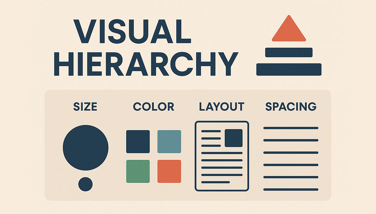
Visual Hierarchy: The Architecture of Attention
Visual hierarchy is the organisation of visual elements in a way that communicates their relative importance and guides the user's eye through the content in the intended sequence.
It is architecture for the eye. The user should never have to decide where to look first. The hierarchy should tell them.
Every page has a most important element. It might be a headline. It might be a product image. It might be a CTA button. Whatever it is, every other element on the page should be visually subordinate to it. Not invisible. Subordinate.
The six tools for creating visual hierarchy are size, weight, color, position, spacing, and contrast. You do not need all six on every page. But you need to apply at least two or three deliberately and consistently.
Size
The simplest and most direct hierarchy tool. Larger elements claim attention. Smaller elements recede.
Your most important text element should be the largest. On a homepage, this is usually the headline. On a product page, it might be the product name or the price. On a landing page, it is the hook.
The size relationship between hierarchy levels should be meaningful, not marginal. A heading that is 20px and a subheading that is 18px barely registers as a difference. A heading at 48px and a subheading at 24px creates a clear, immediate hierarchy.
The principle extends beyond text. Larger images attract more attention than smaller ones. A full-bleed hero image commands the page. A small thumbnail beside body text does not.
Weight
Bold text draws the eye within a body of regular text. It creates local hierarchy, points of emphasis within a continuous reading flow.
Use weight to highlight the most critical information in a paragraph or section. A client result, a key statistic, a warning. Not every sentence. Bolding too much dilutes the effect until nothing is emphasised and everything feels noisy.
Weight in headings communicates importance across levels. A bold H1 versus a lighter-weight H2 communicates that the H1 is the primary heading without requiring the user to read either.
Color
A single colored element in a neutral composition commands immediate attention. This is why CTA buttons use your primary or accent color. The color is rare enough in the overall design that when it appears, the eye goes to it.
Color hierarchy works best when your palette has clear roles. Your background and text colors handle the majority of the visual space in neutral tones. Your accent color appears only on elements you want to attract attention: primary CTAs, key statistics, important labels. When the accent color is rare, it is powerful. When it appears everywhere, it loses its directional value.
Color also communicates semantic hierarchy. Darker text on a lighter background for primary content. Lighter text for secondary content. The contrast difference tells the user which content is more important before they read a word.
Position
Users from left-to-right reading cultures scan pages in predictable patterns. The F-pattern for text-heavy content and the Z-pattern for sparse visual content are the most documented.
In the F-pattern, users read the first line fully, then scan down the left edge, reading partial lines at points of interest. This means the most important words in a paragraph should appear at the beginning of sentences, not the end. Lists with strong lead words are more readable than lists with weak openers.
In the Z-pattern, common on landing pages and homepages, the eye starts at the top left, scans across to the top right, diagonals down to the bottom left, and scans across to the bottom right. Design that places key elements along this path, headline top left, supporting point top right, testimonial or secondary content mid-page, CTA bottom right, follows natural eye movement.
Positioning above the fold is the highest-value real estate on any page. Elements placed in this area are seen by every visitor. Elements below the fold are seen only by visitors who scroll. Your most important hierarchy elements should always be above the fold.
Spacing
White space, the empty space around and between elements, is one of the most powerful hierarchy tools available. It is also the most frequently misused.
Elements with generous space around them feel important. They are set apart from the page, given room to breathe, treated as significant. A headline with substantial space above and below it feels more authoritative than one crowded by adjacent text.
Elements that are grouped closely together communicate relationship. A label and its value. A heading and the paragraph that follows it. A set of features that belong to the same product. Proximity is understood as connection.
Spacing hierarchy means not all spacing is equal. The space between a heading and its following paragraph should be smaller than the space between two separate sections. The internal padding of a CTA button communicates its importance. A CTA with generous padding feels significant. One with cramped padding feels afterthought.
Contrast
Contrast is not only a color tool. It is a relationship between any two elements: dark and light, large and small, bold and regular, detailed and simple.
High contrast between an element and its surroundings draws the eye. A dark button on a light background. A large headline beside small body text. A detailed photograph against a flat color background.
Low contrast causes elements to recede and blend. This is useful for tertiary content, navigation items that are present but not urgent, footer links, secondary labels.
Designing with deliberate contrast ranges, high contrast for primary elements, medium contrast for secondary, low contrast for tertiary, creates a visual system that communicates importance without the user having to think about it.
Typography: The Functional Foundation of Web Design
Typography is not choosing a nice font. It is building a system of text that communicates clearly, reinforces brand identity, supports visual hierarchy, and renders well across every device and connection speed.
Every typographic decision has a functional consequence. The font you choose affects how long your page takes to load, how legible your text is on a phone screen, and what your brand communicates before a word is read.
Choosing the Right Typefaces
For web use, typefaces fall into practical categories: variable fonts, system fonts, and web fonts loaded via a CDN like Google Fonts.
Variable fonts contain multiple weights and styles in a single file. One HTTP request gives you the full weight range. For performance, they are the best option available.
System fonts are the fonts installed on the user's operating system. Using them means no network request for the font. The text renders immediately. The downside is that you have limited control over the exact appearance across platforms, as system fonts differ between Mac, Windows, iOS, and Android. The system font stack has improved enough that for body text on performance-critical sites, it is worth considering.
Web fonts loaded via CDN offer the widest selection and the best cross-platform consistency. The cost is an additional network request and the potential for flash of unstyled text (FOUT) while the font loads.
For brand-appropriate font selection, consider the personality your brand should communicate:
Geometric sans-serifs (Inter, DM Sans, Plus Jakarta Sans) feel modern, clean, and technology-oriented. They work for most digital products, tech companies, and contemporary service brands.
Humanist sans-serifs (Source Sans Pro, Nunito) feel approachable, warm, and readable. They work for healthcare, education, community-focused brands.
Transitional and modern serifs (Playfair Display, Libre Baskerville, Source Serif Pro) feel authoritative, established, and editorial. They work for law firms, finance, luxury brands, publishing.
Slab serifs (Zilla Slab, Roboto Slab) feel confident and grounded. They work for construction, manufacturing, technical services.
The rule for web: maximum two typefaces. One for headings, one for body. If you need variation, use weight, size, and style within those two families. Loading more typefaces adds HTTP requests, increases page weight, and frequently adds visual noise rather than hierarchy.
Building a Type Scale
A type scale is a predefined set of font sizes used consistently throughout a website. Using sizes from the scale and only the scale creates typographic consistency across the entire site.
A practical web type scale:
Display: 64-80px (hero headlines, major landing page headings) H1: 48-56px (page titles) H2: 36-40px (section headings) H3: 28-32px (subsection headings) H4: 22-24px (component headings, card titles) H5: 18-20px (smaller component headings) Body Large: 18-20px (introductory paragraphs, featured quotes) Body: 16-17px (standard paragraph text) Body Small: 14-15px (captions, secondary labels) Caption: 12-13px (metadata, footnotes)
These sizes should be defined in your CSS as variables and applied consistently. Never set an arbitrary font size outside the scale for a one-off element.
On mobile, the same scale applies but every size reduces proportionally. Display text on mobile is typically 36-48px. H1 is 32-36px. Body text should not go below 16px on mobile.
Line Height, Tracking, and Paragraph Width
Three typographic properties that most non-designers ignore and that have significant impact on reading comfort.
Line height (leading in print) is the vertical space between lines of text. For body copy, 1.5 is a reliable standard. Below 1.4 feels cramped. Above 1.7 feels disconnected. For headings, tighter line height works because headings are short. Use 1.1 to 1.3 for headings.
Letter spacing (tracking) controls the horizontal space between characters. Body text should be set at 0 or very slightly positive tracking. Reducing tracking on body text hurts readability. Small all-caps labels and overline text often benefit from slightly increased tracking, around 0.05 to 0.1em. Large display headings sometimes benefit from slightly negative tracking.
Paragraph width, the measure, is the horizontal length of a line of text. The comfortable reading range is 55 to 75 characters. Count the characters across one line of your body copy. If you are regularly exceeding 80 or running below 45, the reading experience is compromised.
This means your content areas should not be full-width on large screens. A 1400px wide container with edge-to-edge body text is not readable. Use max-width on your text containers to constrain line length regardless of viewport width.
.prose {
  max-width: 68ch; /* ch unit = width of the "0" character in current font */
}
Typographic Hierarchy in Practice
A type scale only creates hierarchy when the sizes are applied with intention.
On a homepage, the display or H1 size is reserved for the single most important statement on the page, the hero headline. Every other text element is smaller. The difference in size between the hero headline and the next largest element should be significant enough to read immediately as hierarchy.
Body copy should be uniform in size and weight with only occasional bolding for emphasis. If body copy varies in size without clear reason, the hierarchy breaks down and the page feels assembled rather than designed.
Subheadings serve as wayfinding within long-form content. They tell the reader what is in each section, allowing skimmers to find what they need without reading in full. Good subheadings are specific, not generic. "How to Write CTAs That Convert" is a useful subhead. "Conclusion" is not.
Color within typography communicates secondary hierarchy. Using your brand accent color on a key phrase or statistic draws attention to it without changing its size. This is useful for callout statistics, pull quotes, and important disclaimers.
Uppercase text for certain labels and categories, navigation items, section labels, badges, creates a typographic contrast that signals "this is a category or label, not body content." Used sparingly, it helps users orient quickly. Used broadly, it is hard to read and loses its signal value.
Applying Visual Hierarchy and Typography to Key Website Sections
Hero Sections
The hero is where hierarchy begins. The headline must be the largest, most visually dominant element on the page. Nothing else competes with it.
Supporting text beneath the headline should be noticeably smaller, typically in body large or H3 range. It adds context but does not compete.
The CTA should be distinct through color, padding, and shape. It should not be the largest element typographically, but it should be visually prominent through its button treatment.
A hero with a background image needs type that contrasts with the image. Dark text on a light image area, or light text on a dark area, with sufficient contrast ratio. Adding a semi-transparent overlay to the image behind the text is a reliable way to ensure contrast regardless of image content.
Navigation
Navigation type should be consistent in size, weight, and spacing. Typically small to medium body size, 14-16px, with regular or medium weight.
The current page or active state should be visually different from inactive navigation items, through weight, color, or an underline indicator.
Dropdown labels should be visually similar to main navigation items. Secondary navigation items within dropdowns can be slightly smaller.
Cards and Listings
Card typography follows a clear internal hierarchy: title, then supporting metadata, then body snippet, then CTA or action. Each level should be visually distinct from the one above it.
Titles: H4 or H5 size, bold or medium weight. Metadata: Caption or body small size, secondary text color. Body: Regular body size, normal weight. CTA: Either a styled link in your brand accent color or a small button.
Consistent card typography across all cards in a listing creates a visual rhythm that users learn quickly. Once they understand the card structure on the first card, they scan subsequent cards faster because they know where to find each piece of information.
Long-Form Content and Blog Posts
Long-form content needs strong typographic hierarchy to remain readable across several thousand words.
The headline and introduction set the context. Subheadings mark sections and aid navigation. Body paragraphs should be short, four to six lines maximum, with generous line height. Block quotes visually separate extended citations from the author's own voice. Callout boxes highlight key takeaways for readers who are skimming.
Pull quotes, taking a key sentence from the text and displaying it at larger size, create visual interest in long text and reward skimmers with the most important points.
Common Hierarchy and Typography Mistakes to Avoid
Too many font sizes. If every element on your page seems to be a different size, you do not have a hierarchy. You have chaos. Commit to the scale.
Every word bolded. Bold as emphasis loses all meaning when half the text is bold. Use it rarely.
Low contrast on headings for aesthetic reasons. A light gray H1 on a white background may look minimal and sophisticated on a designer's monitor. On a user's phone in ordinary light, it is nearly invisible.
Justified text on the web. Full text justification creates uneven word spacing that disrupts reading flow, particularly at narrow column widths. Left-align your body copy.
Mixing too many typefaces. Each additional typeface creates an additional network request and adds visual complexity. Two families are sufficient for any professional website.
Ignoring mobile typography. Many designers set font sizes on desktop and assume the responsive scaling will take care of mobile. It does not. Check every typographic level on a real mobile device.
Text over uncontrolled images. Placing text over a full-bleed photograph without an overlay or sufficient contrast between the text and the image area guarantees readability failures across different screens.
Conclusion
Visual hierarchy and typography are not decorative disciplines. They are functional ones.
Every choice you make about font size, weight, color, spacing, and position either serves the user or costs you their attention. A headline that does not read as the most important thing on the page, a body font that is too small or too light to read comfortably, a type scale with no consistent logic, these failures are invisible to the designer who builds in ideal conditions and obvious to the user who encounters them in the real world.
Build a type scale. Apply it consistently. Use hierarchy tools deliberately. Test with real users in real conditions.
The result is a website where reading feels effortless because the design is working. That is the goal.
Ready to Fix Your Website's Design?
JetherVerse builds websites where every typographic and visual decision is made with purpose. Clean, readable, on-brand, and built to convert.
- Email: info@jetherverse.net.ng
- Phone: +234 915 983 1034
- Website: www.jetherverse.net.ng
Related Articles
- How to Design a Website the Right Way: The Complete Guide
- UI/UX Design Principles Every Website Needs in 2026
- Brand Identity in Web Design: Building a Site That Looks Like You